I'm Logan, a UNC Computer Science + Media AD/PR major interested in web design, graphic design, and software engineering. I build interfaces that are visually appealing and user-centric.

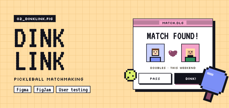
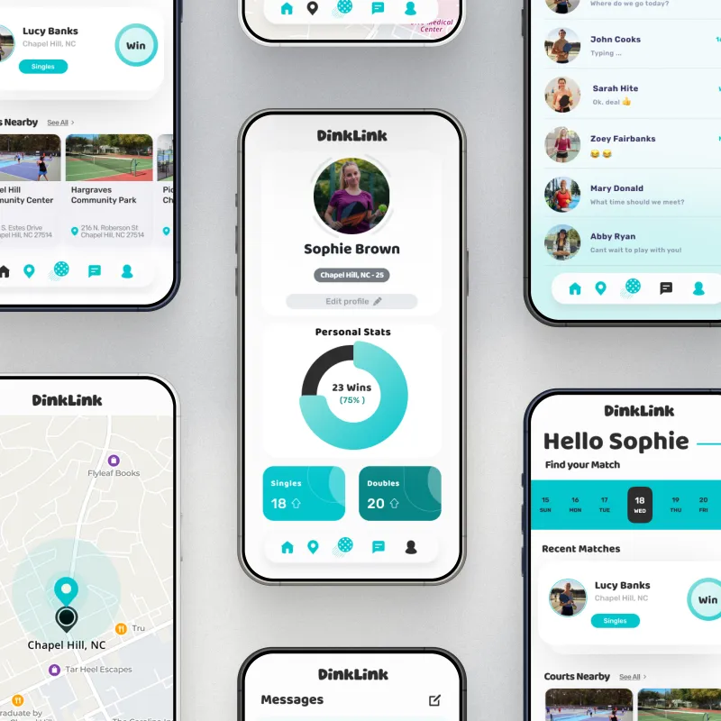
UI/UX design for a pickleball matchmaking app featuring player profiles and stats.
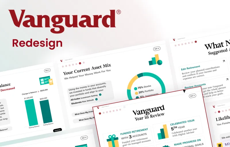
Responsive redesign focused on clarity, confidence, and trust for everyday investors.
React tool that critiques an interface with a local LLM against Nielsen's 10 heuristics and WCAG.
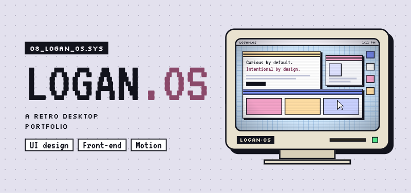
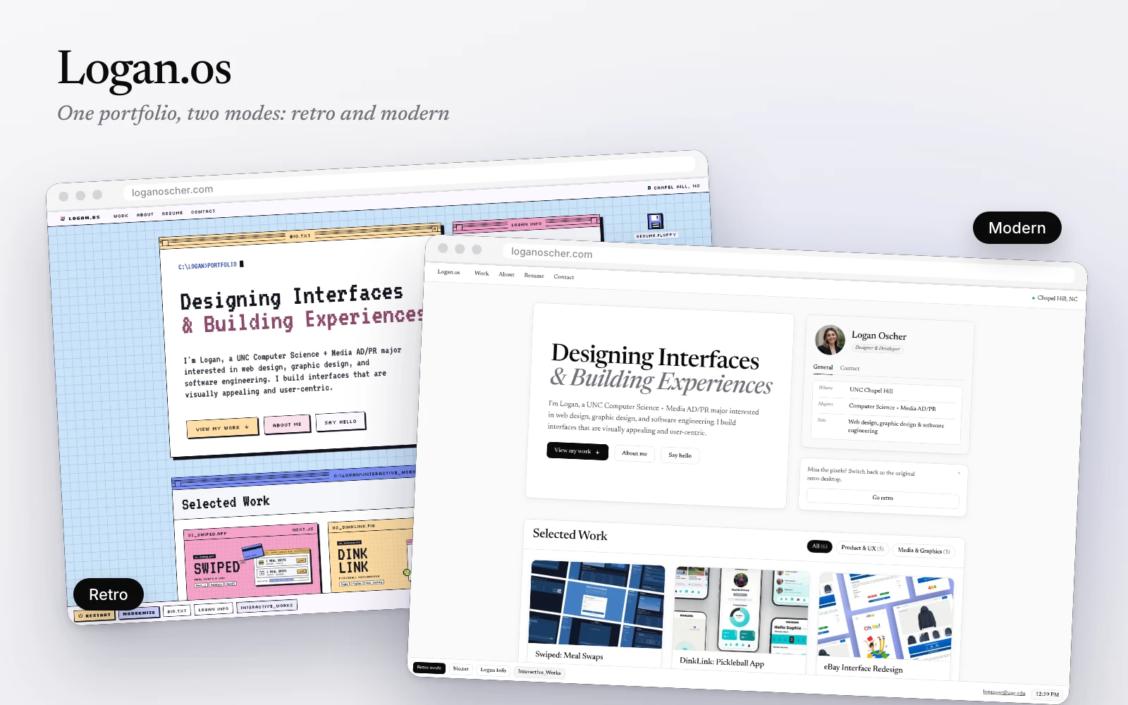
The retro desktop you're on, with a Modern mode, built from Google Stitch explorations with Claude.
Full Stack Development · Product Design
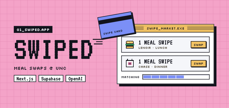
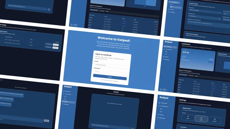
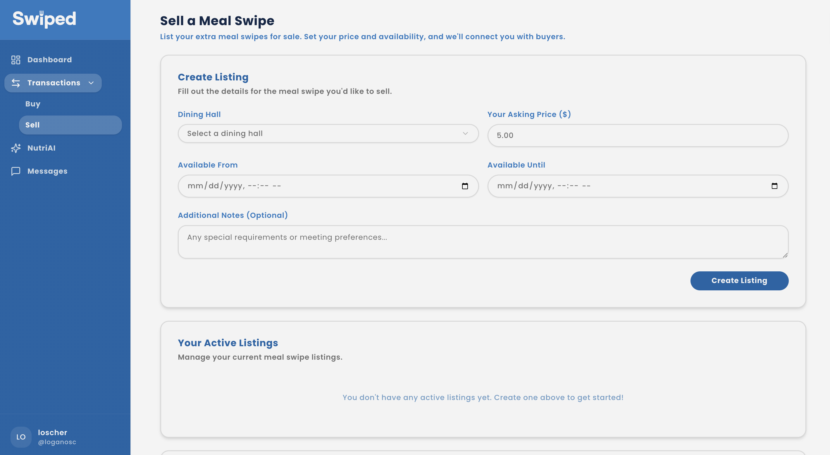
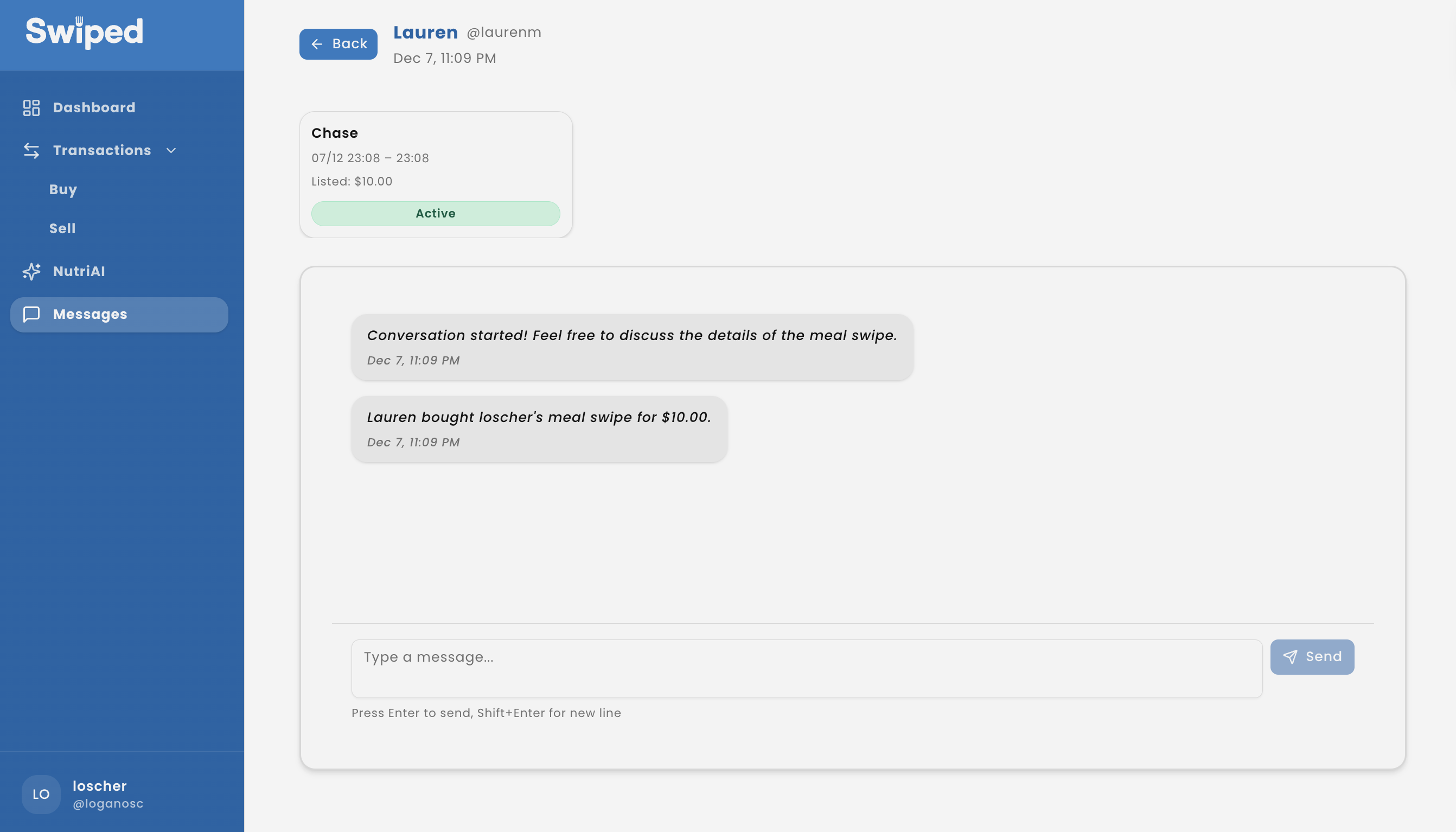
A full-stack Next.js app that lets classmates buy and sell UNC dining swipes with live chat, NutriAI assistance, and a dashboard for listings and history—built for COMP 426.
Students with dining plans ended every week with unused swipes while classmates without plans struggled to afford campus meals.
Make exchanging swipes feel safe, fast, and fair with authenticated accounts, clear listings, and live chat.
Full-stack web app with Supabase-authenticated accounts, live marketplace to sell/buy swipes, real-time chat per listing, and an AI nutrition planner backed by Supabase Realtime.
Existing “group chat trading” was messy and slow. We saw a chance to replace ad-hoc posts with a structured marketplace where listings, pricing, and chat stay in one place.
Full-stack sprint: Next.js + TypeScript with Tailwind/shadcn UI, Supabase for auth/DB/Realtime, Drizzle + tRPC for type-safe data, and a scraper-fed OpenAI nutrition assistant.
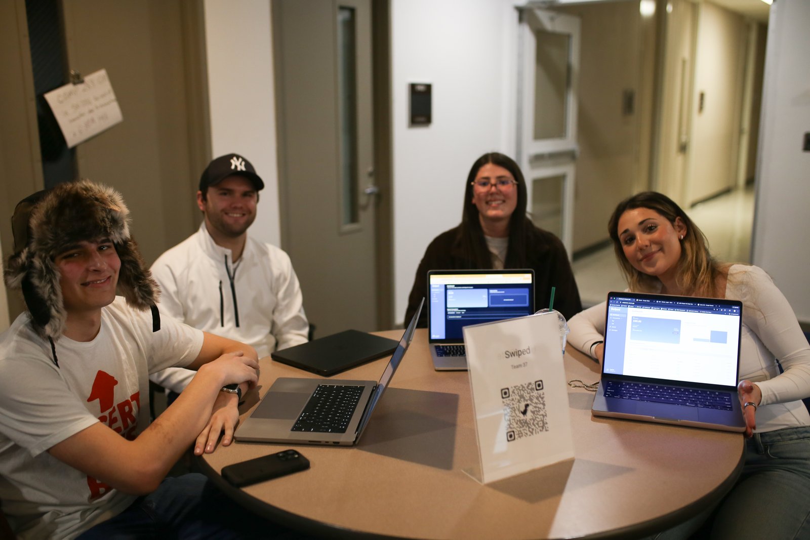
We split design, front-end, and backend tasks across weekly sprints, pairing on tricky flows like chat, listings, and the NutriAI assistant.
Supabase Auth sign-up/login, profiles with display name, username, avatar, theme preference, and logout from Settings.
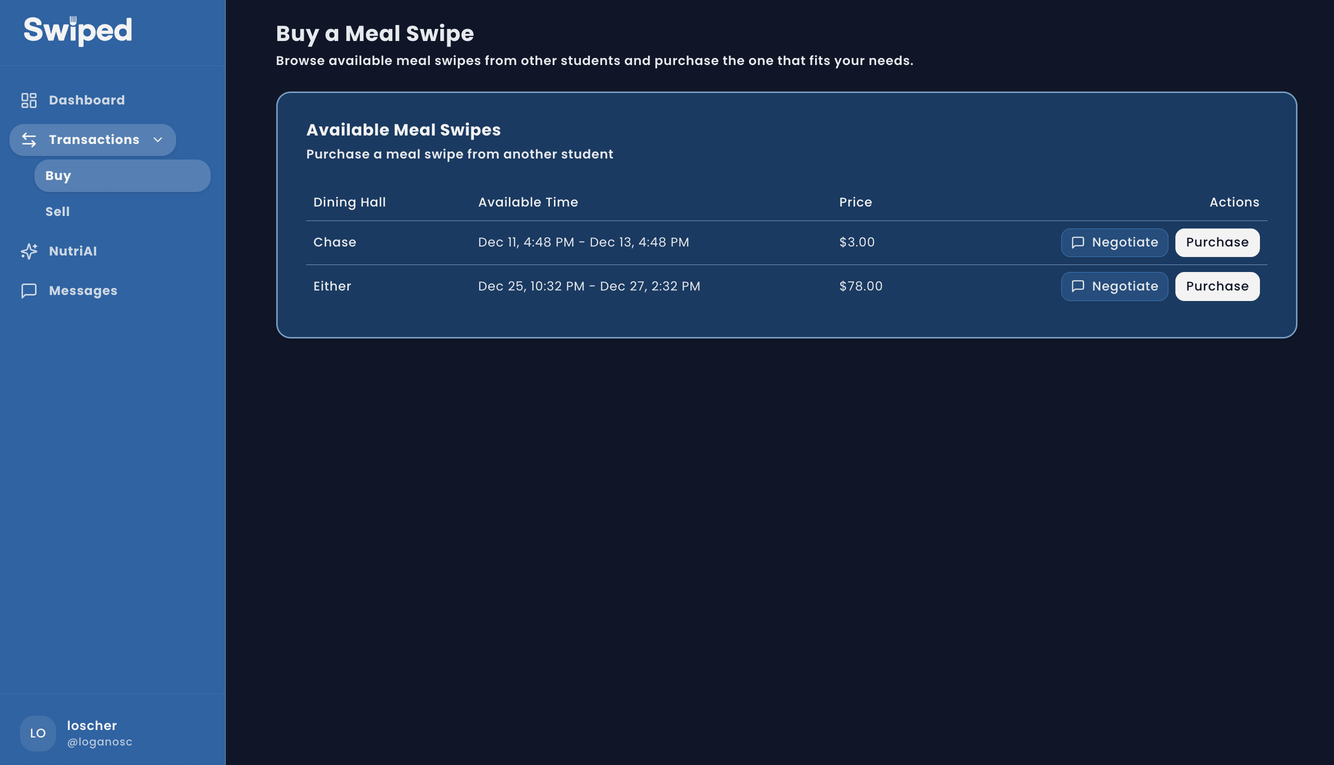
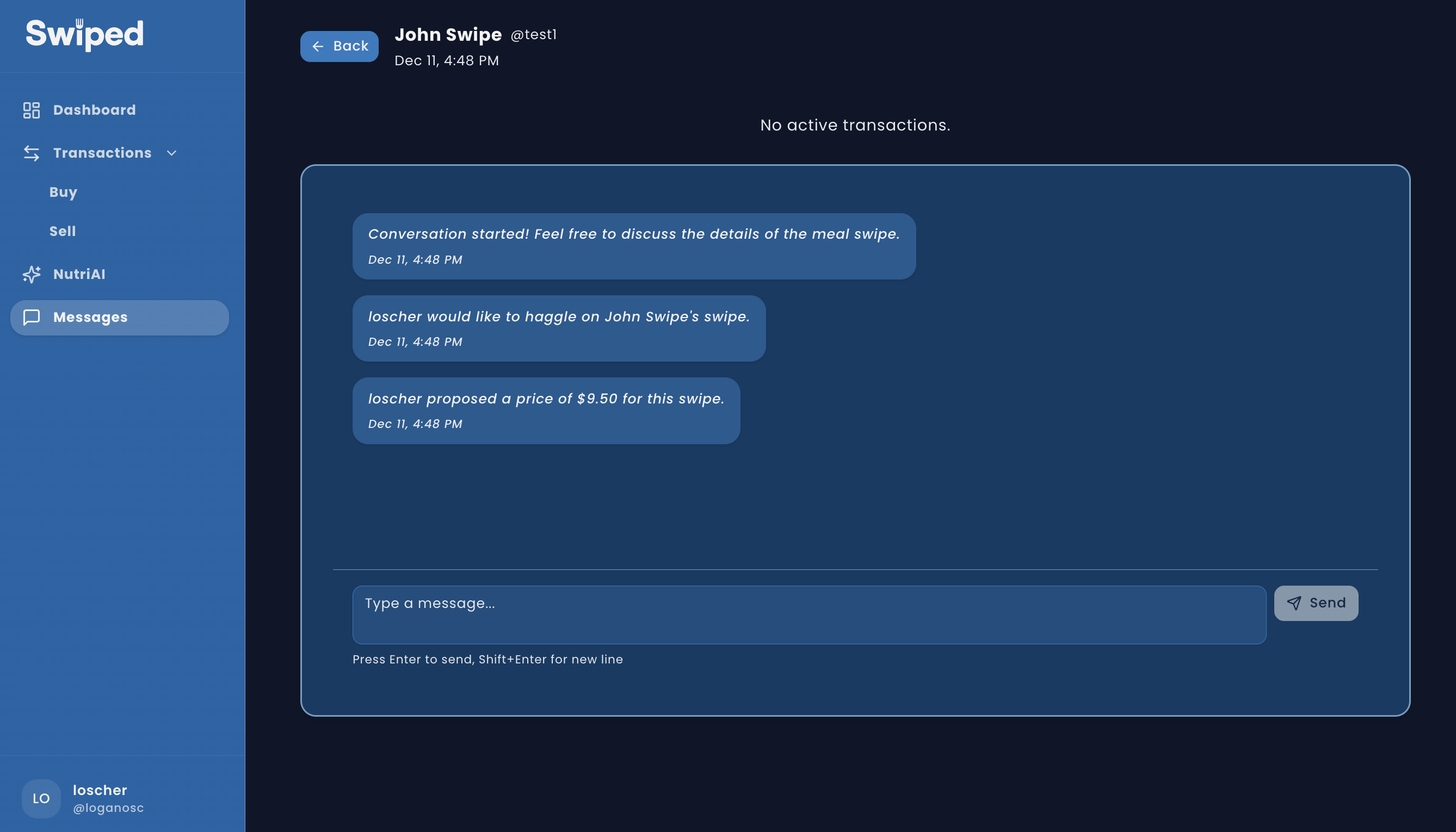
Create and manage sell listings; buyers can purchase at asking price or negotiate via one-to-one chat powered by Supabase Realtime with unread counts.
OpenAI-backed chat answers nutrition questions about UNC dining halls using scraped menu data; prompt guards keep replies nutrition-only.
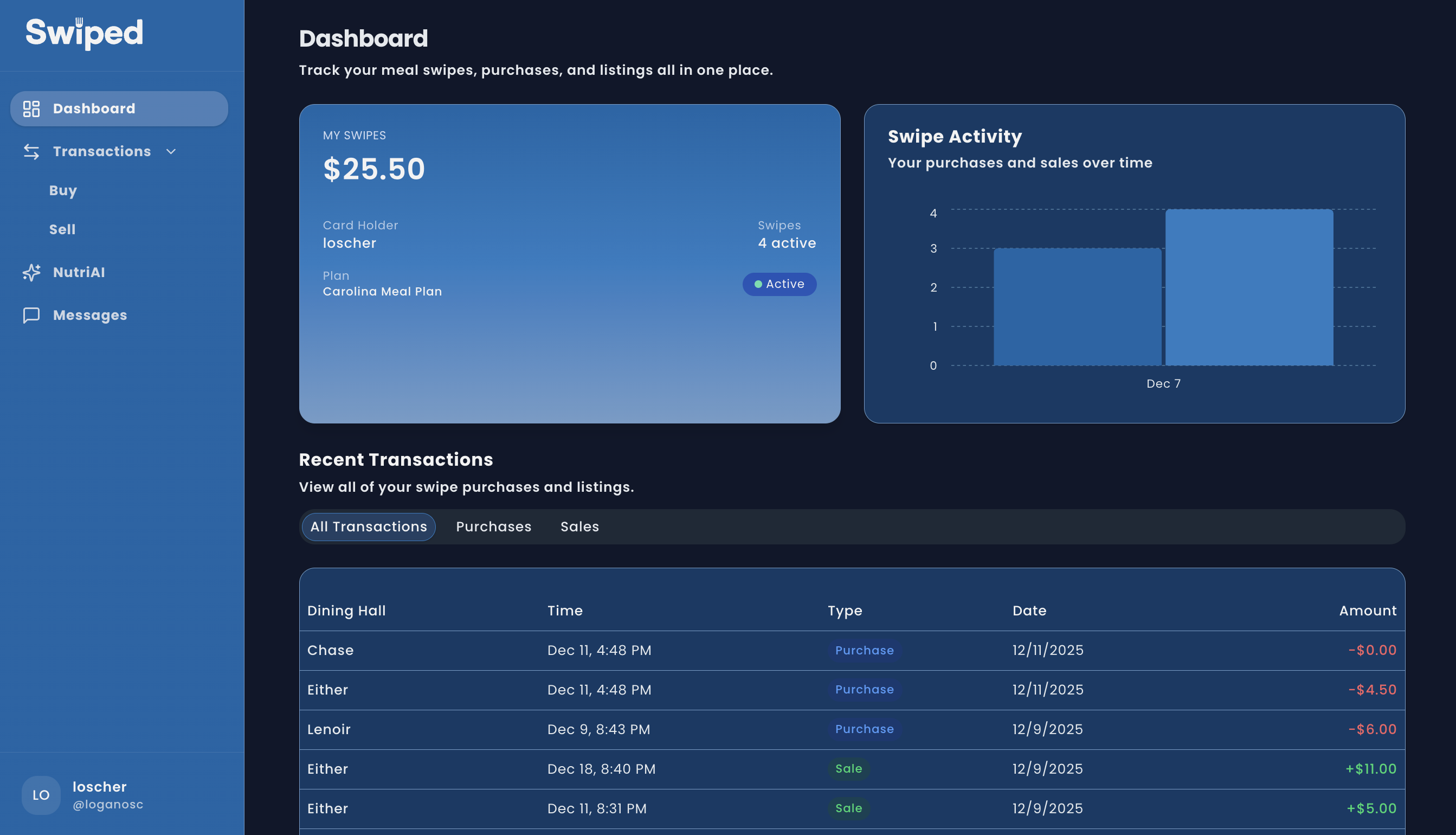
Weekly activity, balances, and transaction tables (Recharts + tables) to audit purchases and sales across the semester.
Core flows: create a sell listing, browse/buy or negotiate, and keep the deal in-sync with live chat.
Students ask about dining hall foods, nutrition details, or meal ideas; responses come back instantly in-app and update in the chat thread.
OpenAI API generates answers scoped to scraped menu data; Supabase Realtime inserts broadcast new chat messages so the answer appears instantly for the asker.
Prompt engineering forces nutrition-only responses, blocking homework or unrelated topics to keep the tool on-mission.
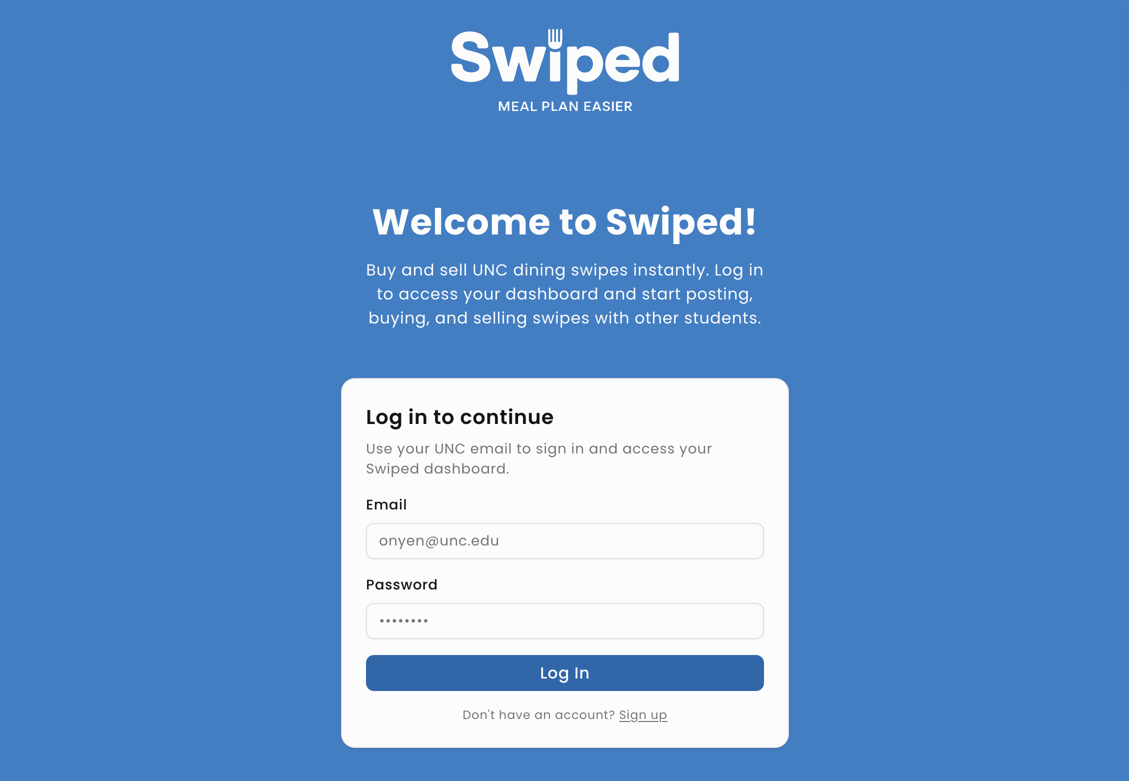
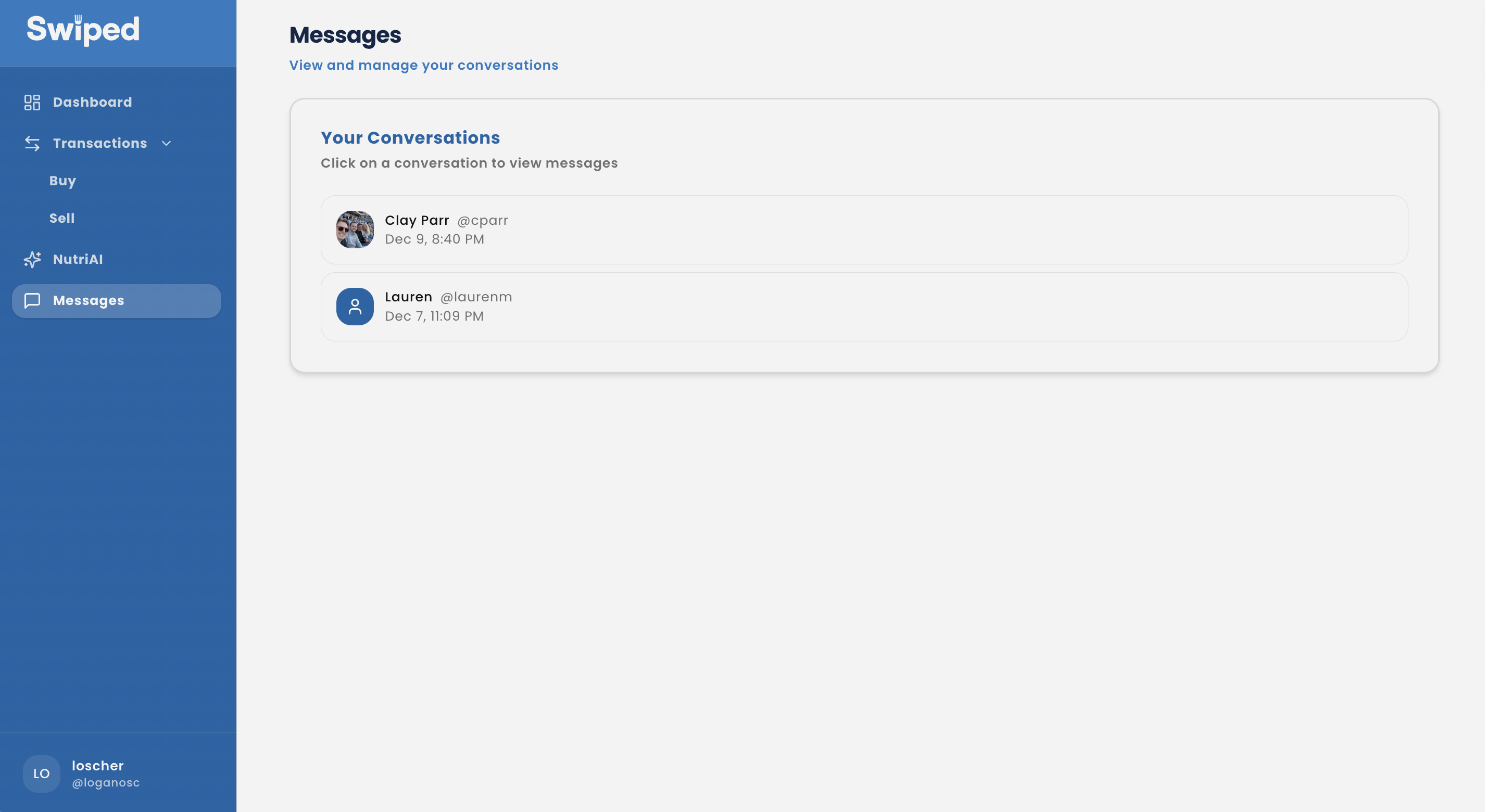
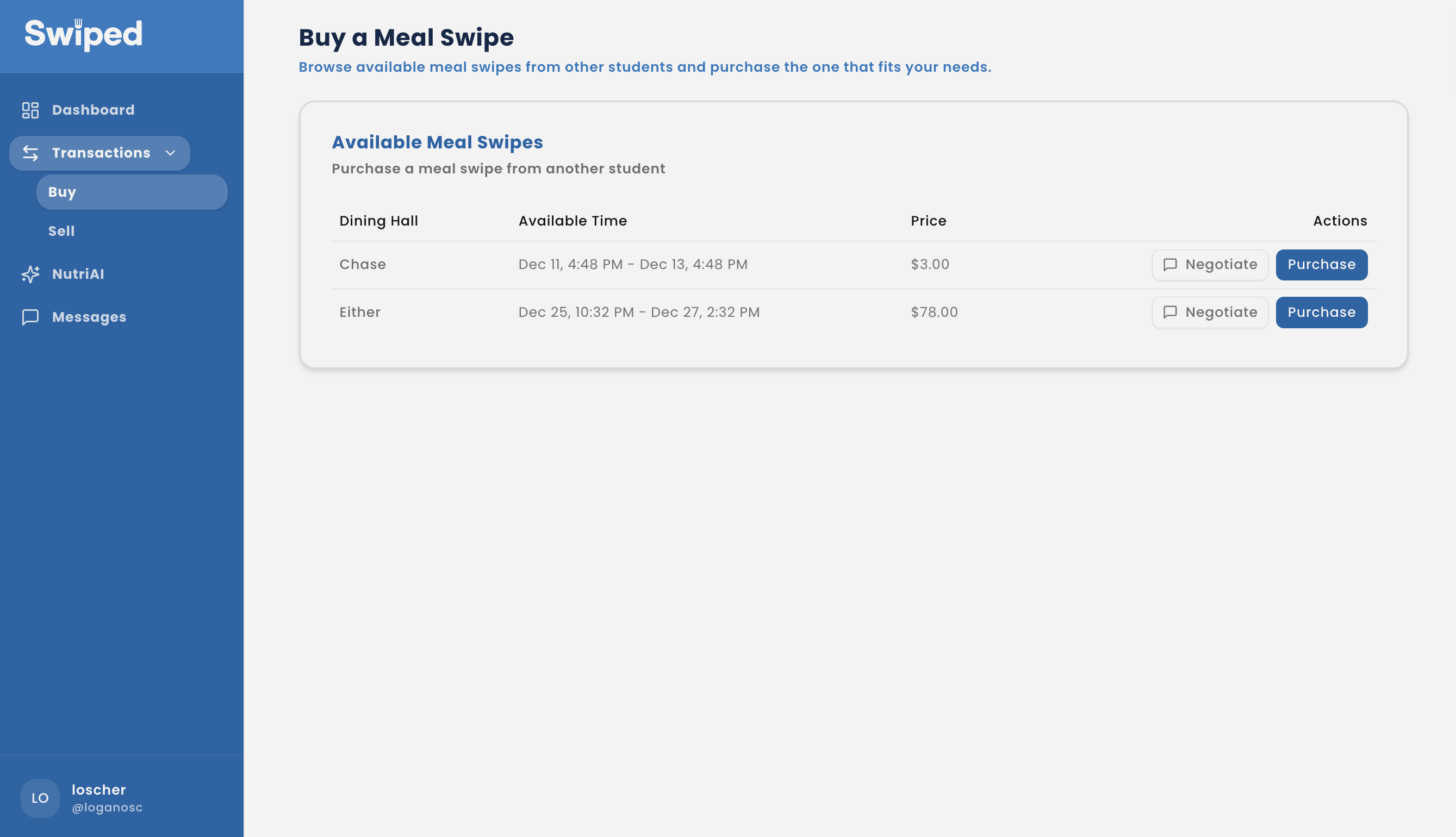
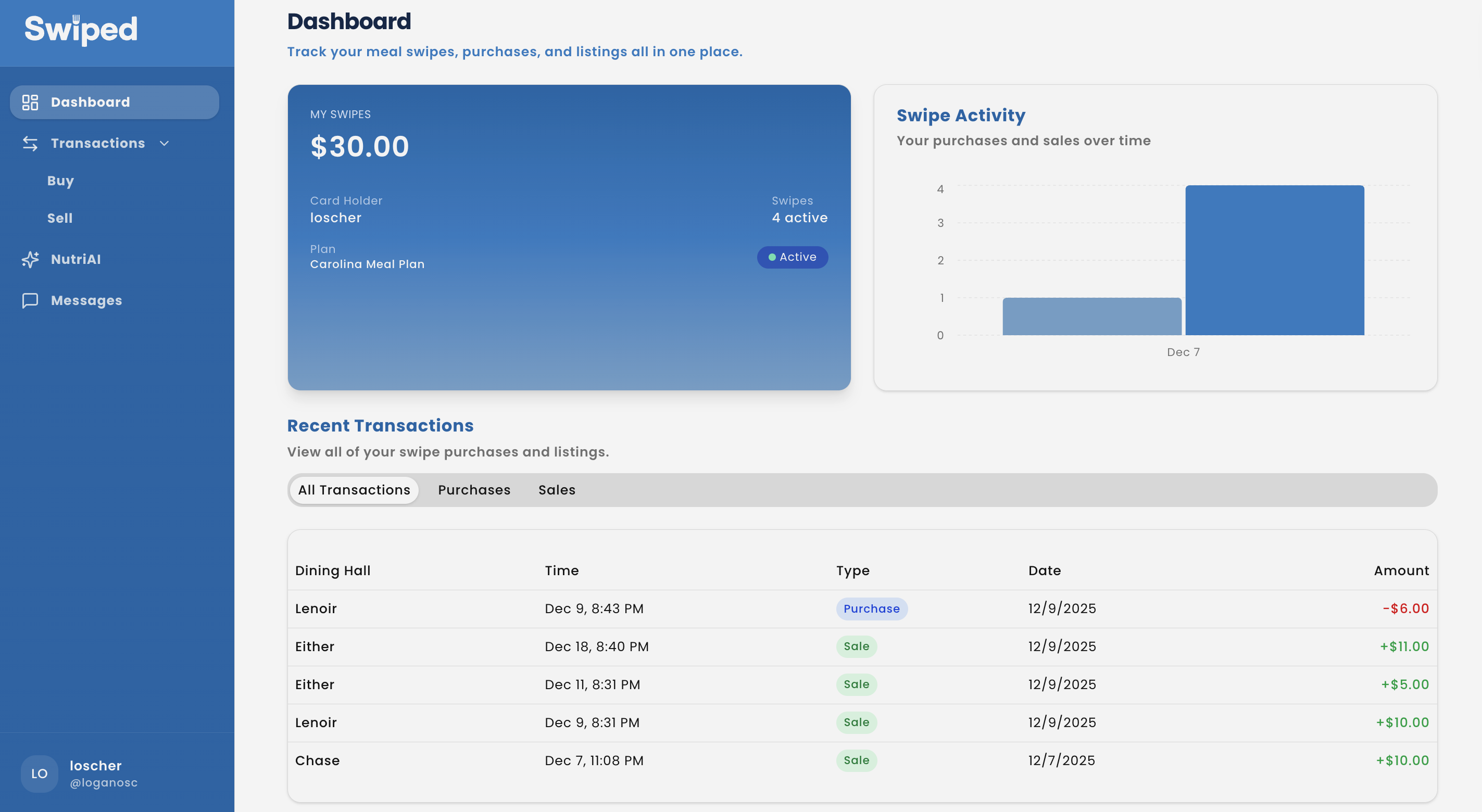
Next.js 15 + TypeScript with tRPC, Tailwind + shadcn/ui, Recharts; Supabase Auth/Postgres/Realtime with Drizzle ORM for schema + queries.
Cheerio/TSX script scrapes the dining hall site (npm run scrape-cds-menu) to keep menus current for listings and NutriAI context.
Supabase Realtime channels broadcast new listings, negotiations, and AI messages instantly; OpenAI prompts are scoped to nutrition to block unrelated questions.
.env.local with OPENAI_KEY, DATABASE_URL, NEXT_PUBLIC_SUPABASE_URL, NEXT_PUBLIC_SUPABASE_PUBLISHABLE_KEY; lint/build scripts keep the repo production-ready.
NutriAI prompt engineering keeps responses nutrition-only, using scraped menu data to avoid off-topic answers.
One-to-one chat per listing replaces ad-hoc DMs so pricing, timing, and decisions stay in a single thread.
Explore the responsive web build of Swiped below or open it in a new tab.
UI/UX · Product Design
Building a mobile product that makes it easy for local players to find partners, organize matches, and keep up with their progress without getting lost in menus.
DinkLink connects recreational and competitive pickleball players through a simple profile, matchmaking, and messaging experience. The goal was to reduce friction for pick-up matches while highlighting the stats and context players need to feel confident when reaching out.
Local players struggled to discover partners who match their skill, schedule, and preferred courts.
A streamlined flow that surfaces nearby players, courts, and recent results in one glanceable feed.
Clearer onboarding, stronger profile signals, and faster conversations increased successful match requests in testing.
I interviewed five recreational players and mapped their current tools: text chains, Facebook groups, and ad-hoc spreadsheets to track scores. The common friction points were confidence in a partner’s skill, knowing which courts were free, and coordinating logistics without endless back-and-forth.
I built the interface in Figma with a focus on clarity: minimal chrome, strong typography, and modular cards that keep stats, partners, and court info aligned. I kept the visual language calm and confident so newcomers feel welcome while advanced players still get the details they expect.
Progression badges, win/loss summaries, and common availability quickly communicate fit.
Filters for distance, skill tier, and preferred format reduce the time to find a partner.
Contextual threads attach location, time, and gear notes so players stay on the same page.
The final flow centers around a home dashboard that balances discovery with action. Players can move from browsing to inviting in under three taps while keeping court logistics transparent.
Nearby partners, suggested courts, and recent matches appear in a single vertically scrollable stream.
Quick-select time blocks and skill tiers auto-populate invites to cut down on coordination messages.
Lightweight charts surface momentum without overwhelming casual players.
Testers were able to create a profile and send their first invite in under three minutes. For a next iteration, I plan to pilot a lightweight availability calendar and integrate local club schedules.
UI/UX · Redesign
Making Vanguard’s Year-in-Review clearer for investors ages 50+, with stronger guidance, trustworthy visuals, and next steps that feel obvious.
UX researcher and product/visual designer redesigning Vanguard’s Year-in-Review for investors 50+.
Semester project using Figma, user testing, card sort/flows, persona work, and PDF deliverables.
Personas, structure/flows, usability findings deck, UI kit, 10+ wireframes, 20+ hi-fi panels, interactive prototypes.
Investors 50+ struggled to find key financial insights. Metrics lacked context, visuals felt decorative instead of informative, and fee information was hard to uncover—eroding clarity and trust.
Enhance clarity, trust, and usability for digitally active investors 50+. The work was driven by research, moderated tests, surveys, and accessibility priorities.
Digitally active investors ages 50–70 who value straightforward wording, trust signals, and simplified navigation that tells a clear financial story.
They want reassurance that every step is purposeful, with language that reduces anxiety and highlights why actions matter.
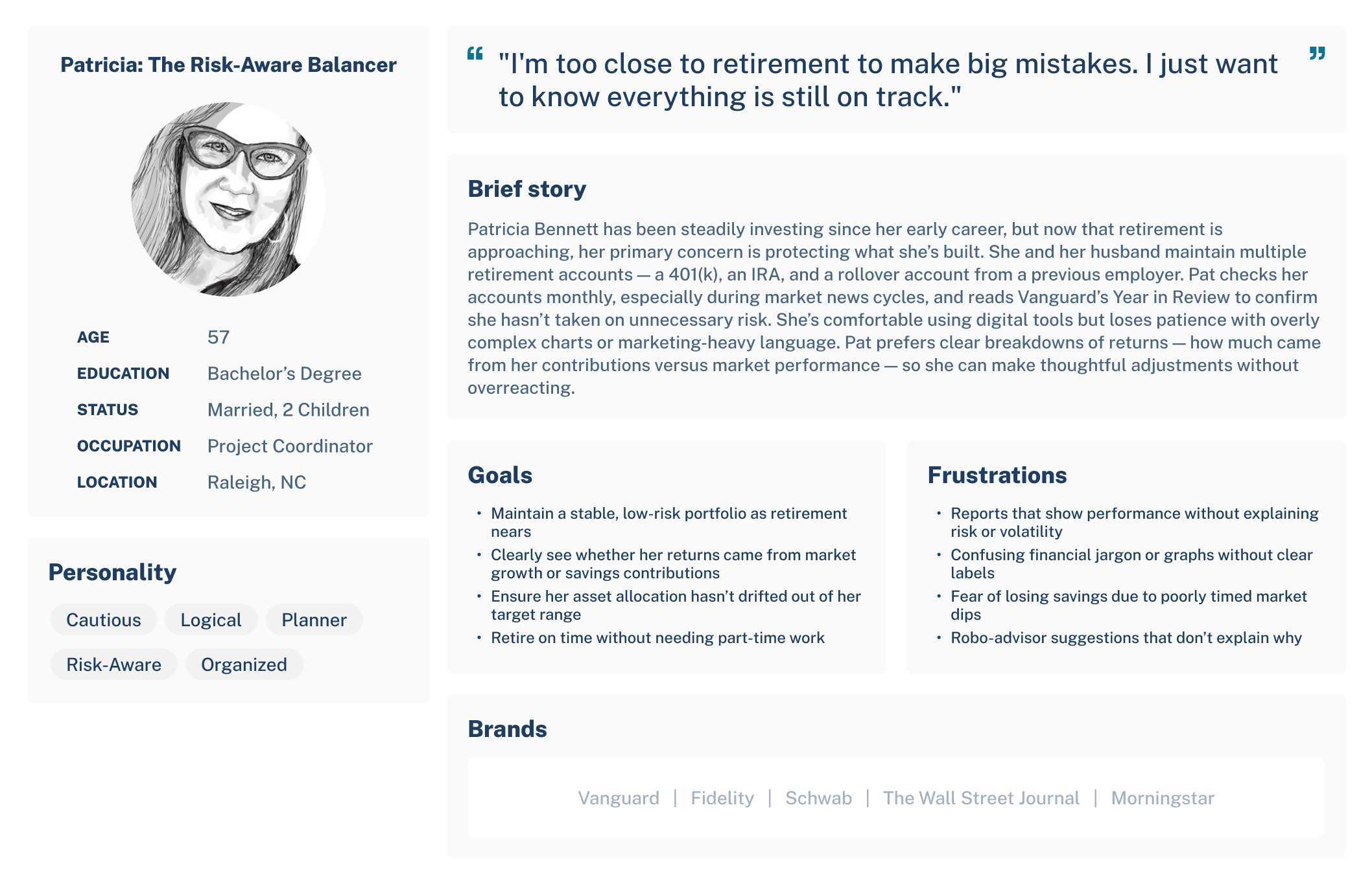
50–70 age group interviews and empathy work to surface needs for clarity, trust signals, and predictable next steps.
Think-aloud sessions and surveys with 50+ investors on the existing Year-in-Review revealed navigation confusion, jargon friction, and weak next-step guidance.
Guided anchors, plain language, contextual tooltips, and checklist clarity mapped directly to observed pain points.
See embedded testing deck for full findings and methods.
50+ participants evaluated the Year-in-Review prototype via think-aloud sessions, tasks, and pre/post surveys to measure comprehension, trust, and next-step clarity.
Usability findings presentation embedded below.
Mapped the revised Year-in-Review structure and key flows to clarify entry points, task progression, and how users branch into deeper tasks without losing context.

Initial sketches and grayscale frames to validate structure before adding visual polish and interactions.
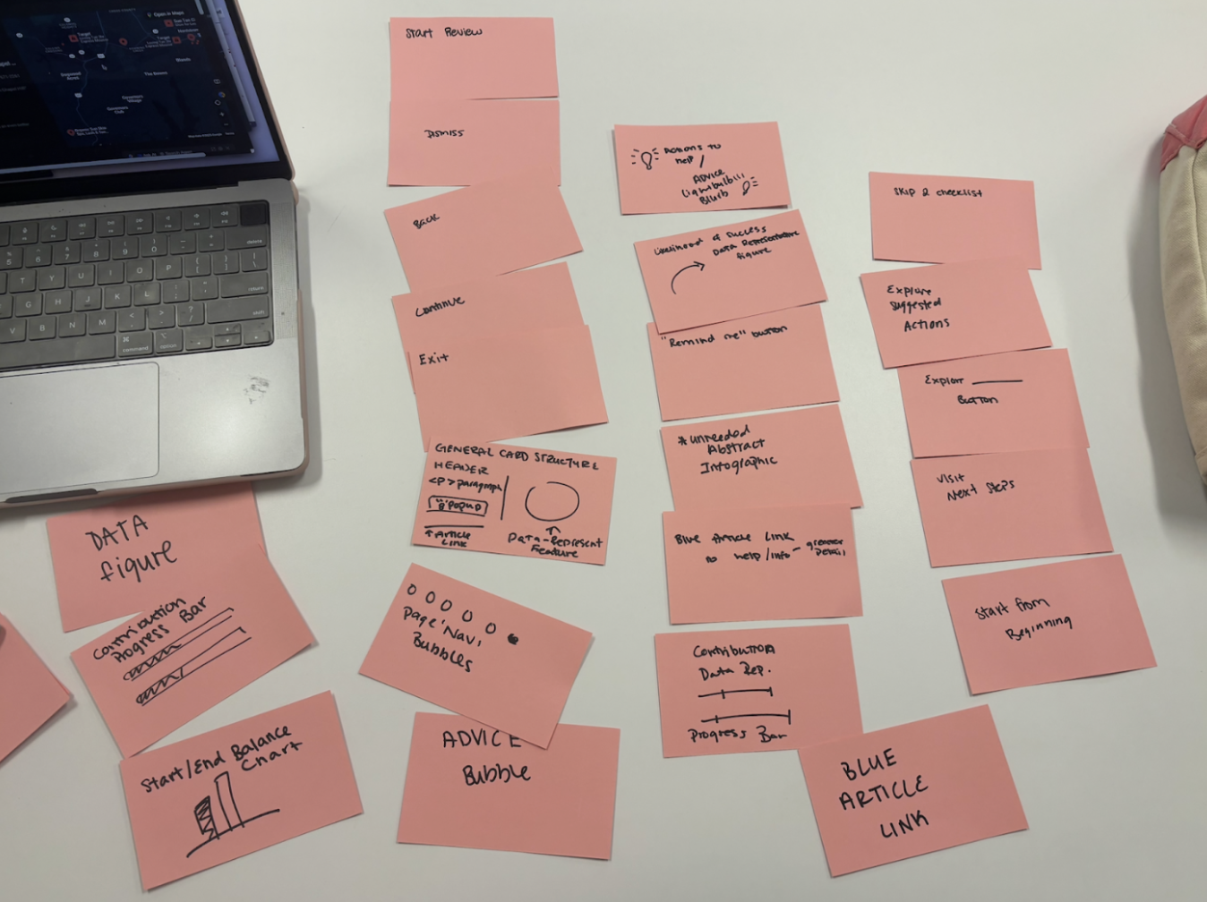
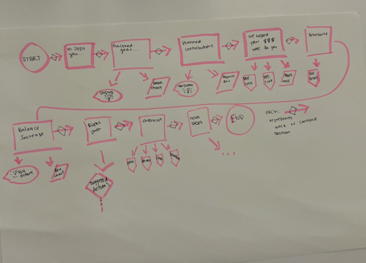
10+ grayscale/mid-fi screens vetted for hierarchy, flow, and terminology before hi-fi styling.
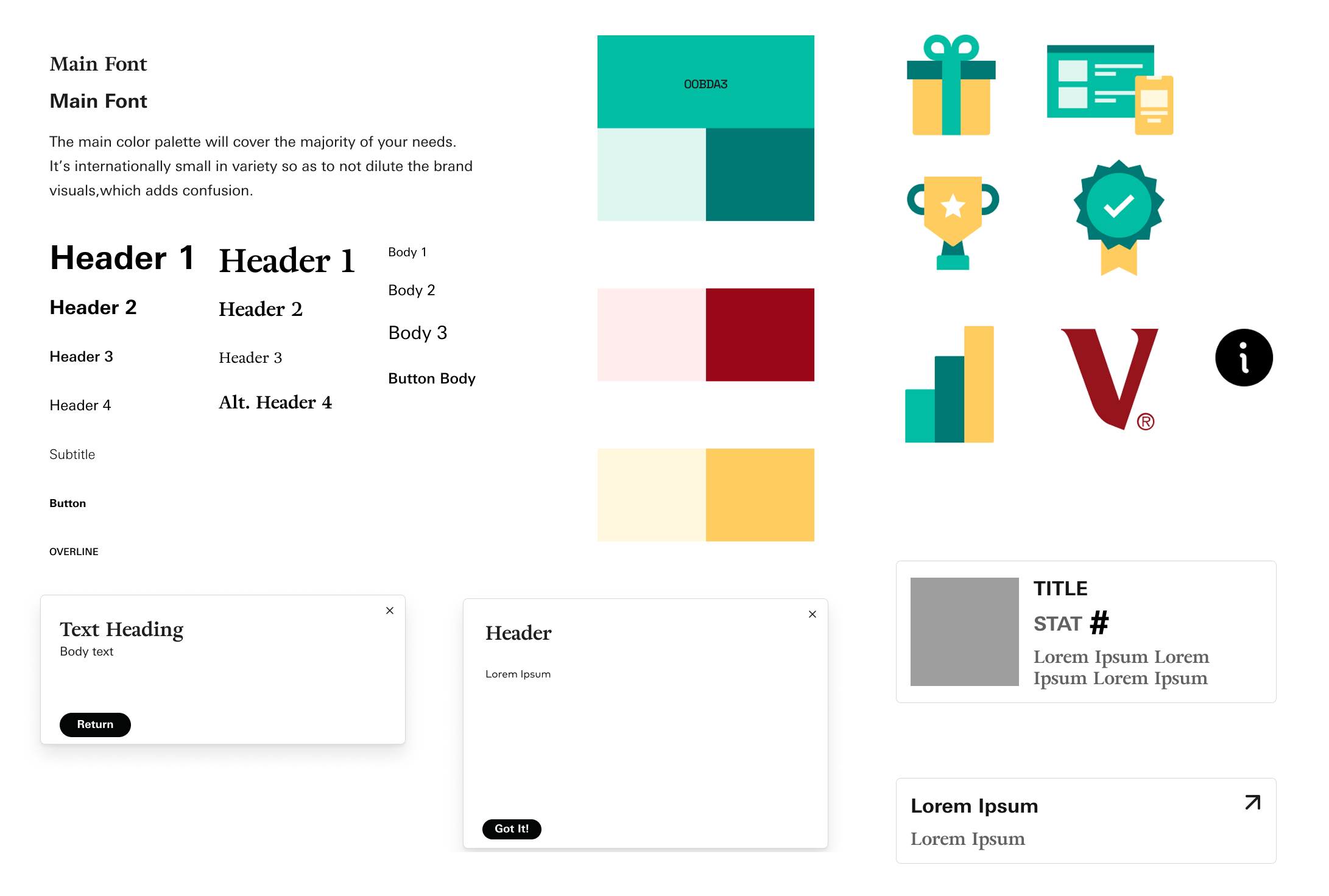
Color palette, typography, and components aligned to Vanguard to keep the experience consistent end to end.
Early explorations captured as quick sketches and task progression snapshots before moving into mid- and hi-fi work.
Balanced clarity for beginners with deeper breakdowns for advanced users by layering defaults, tooltips, and optional detail drawers.
Kept language short but added inline definitions and info icons so jargon never blocks progress.
Used numbered anchors and progress cues without overcrowding the UI, prioritizing readability over decorative visuals.
Lead with a signature flow: numbered anchors and plain-language action labels (Edit Retirement, Review Contributions, Review Accounts, Goal Optimizer) that create a predictable path for 50+ users.
Replaces playful visuals with a readability-first hierarchy, tying graphs directly to insights and pairing each step with a short “why this matters” narrative.
Builds confidence through contextual tooltips, info icons, and reassuring copy that keep complex terms and next steps clear—reducing end-of-journey confusion and anxiety.
View the full case study and wireframes below, or open them directly in a new tab.
20+ hi-fi panels across the mac flow; Figma links set to “Anyone with the link can view.”
This redesign pairs straightforward language with a guided structure to lower friction for a regulated, high-stakes flow. Next iterations would A/B test the numbered path, refine checklist clarity, and expand analytics around where investors pause after reading their performance story.
UI/UX · Redesign
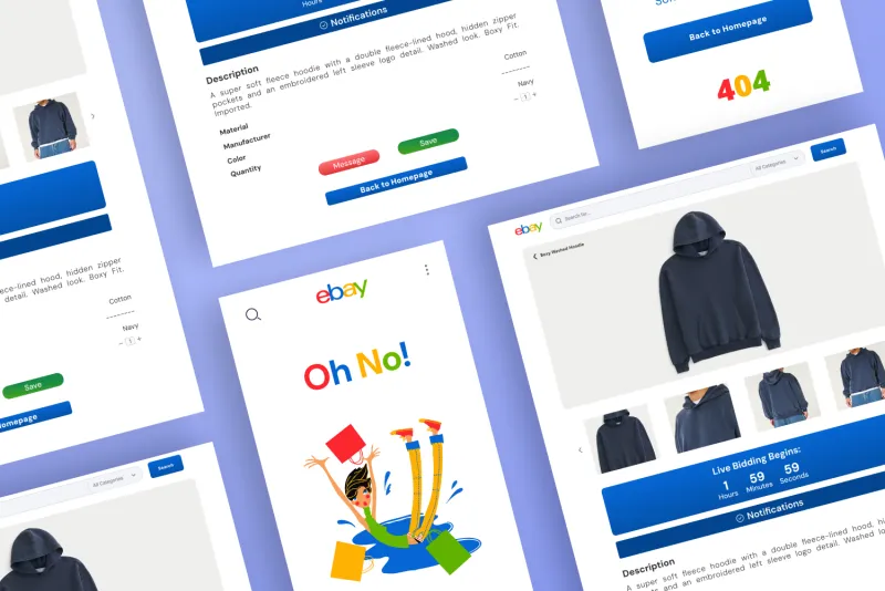
I reimagined the eBay browsing and product-detail experience with a modern layout and simplified user flow. This project focused on reducing visual clutter, strengthening the hierarchy of information, and improving the bidding and product selection process. I redesigned the product page, error screen, and navigation components to make the platform feel more intuitive and consistent across devices. The final system presents a cleaner shopping experience with clear call-to-actions and a more user-friendly structure.
About me
I've always been drawn to the intersection of design, technology, and user experience. As a fourth-year undergraduate student at UNC Chapel Hill pursuing a double major in Computer Science and Media & Journalism, I am focused on UI/UX design, web design, and interactive media. My passion for UI/UX, graphic design, and web design drives me to create content that is both visually appealing and user-centric. From 3D printing and laser cutting to building user-friendly web interfaces, I am constantly seeking ways to enhance the way people interact with technology.
AI Tool · Product Design + Front-End
A designer-first web tool that turns a screenshot, a page's code, or both into a structured UX critique from a local LLM. It reviews the interface against Jakob Nielsen's 10 usability heuristics and WCAG accessibility, and every issue comes back sorted by category, rated by severity, tied to a heuristic, and paired with a specific fix.
General-purpose AI chat gives loose, unstructured design feedback that's hard to act on, and uploading work-in-progress to a cloud service isn't always an option.
Give designers critique they can work through like a checklist: grouped by UX category, ranked by severity, grounded in an established heuristic, tied to an element on the screen, and run entirely on their own machine.
A React app that returns distinct, heuristic-cited, severity-rated issues with a specific fix for each, follow-up questions, and a styled PDF report, plus a Chrome extension that captures any page. The app itself meets WCAG 2.1 AA.
Design critiques follow a familiar rubric (usability, accessibility, hierarchy, interaction, consistency) and a shared vocabulary in Nielsen's heuristics. Asking a model to answer in that exact shape, citing the heuristic each issue breaks, makes its feedback far easier to scan, trust, and act on.
Design the tool like a design tool: a canvas for the work and an inspector for the findings, then build it in React with a small utility layer that talks to Ollama and cleans up whatever the model returns.
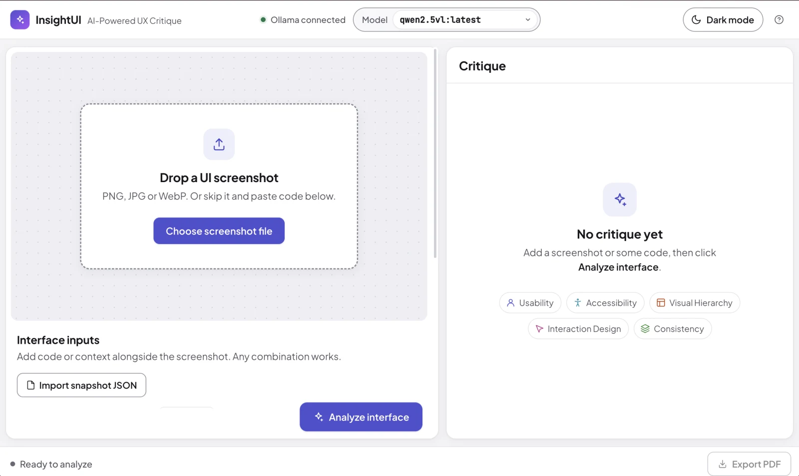
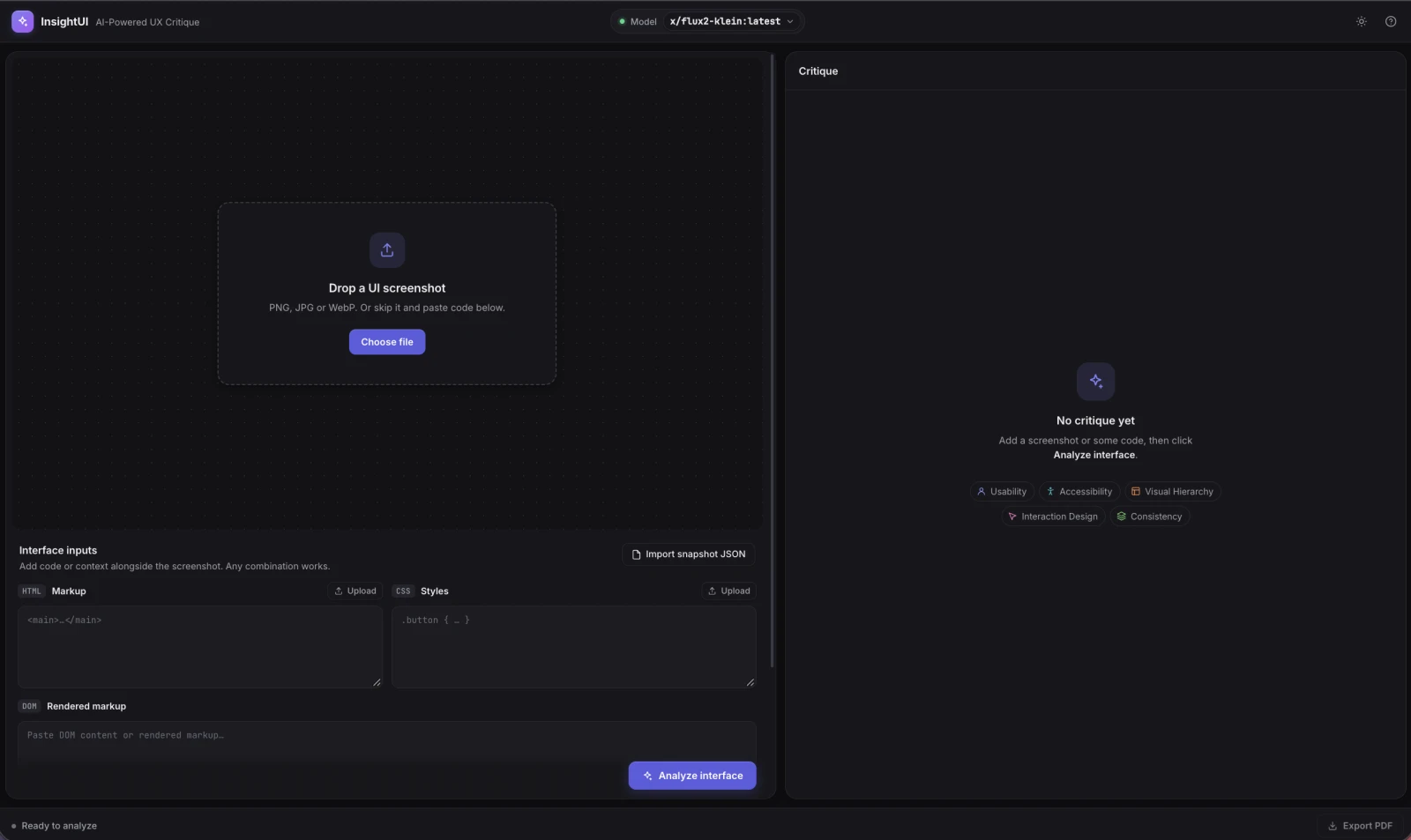
A split-screen layout (55% canvas, 45% inspector) that stacks on narrow windows, with a screenshot viewer you can zoom and pan by mouse or keyboard, and a light theme with a labeled Dark mode toggle.
Drag-and-drop screenshots, pasted or uploaded HTML and CSS, rendered DOM markup, and a short product description. Any combination works.
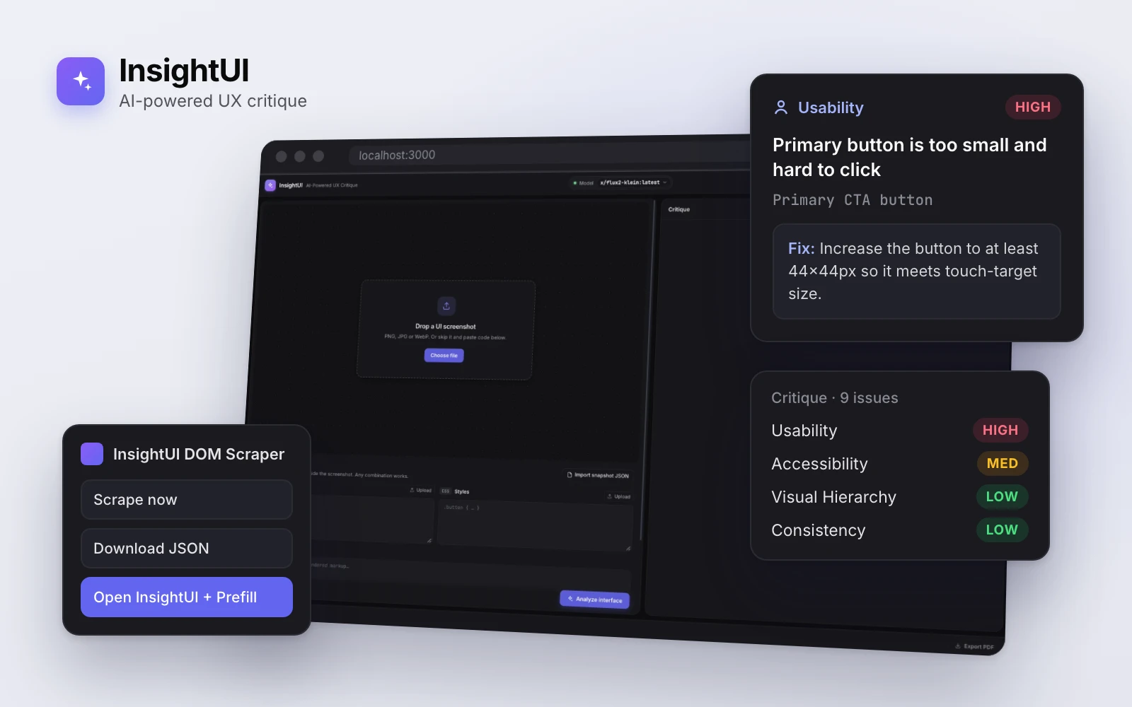
Each card shows the affected element, a High, Medium, or Low severity badge, the issue, and the Nielsen heuristic it violates. Clicking one (or pressing Enter) highlights its area on the screenshot and reveals the fix and a follow-up question button.
Built to WCAG 2.1 AA: 4.5:1 text contrast in both themes, status never shown by color alone, full keyboard operation with a skip link and visible focus, screen-reader announcements, reflow at 200% zoom, and reduced-motion support.
A PDF report styled like the app, with Plus Jakarta Sans embedded: a severity summary, the screenshot, and every issue with its heuristic, severity, and fix. The model picker lists the user's Ollama models and hides ones that can't analyze an interface.
The canvas and inspector before an analysis, with a fashion landing page as the test interface.
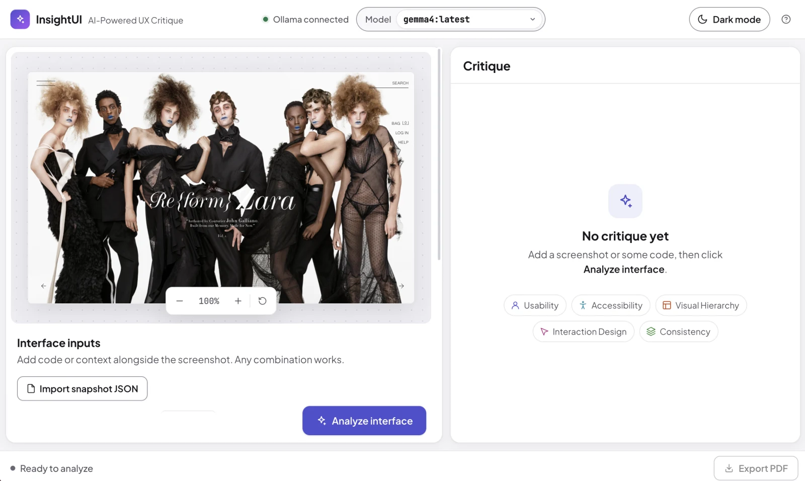
The exported report from analyzing the screenshot above with gemma4: 13 distinct issues (6 high, 7 medium), each with the affected element, a severity, the Nielsen heuristic it violates, and a specific fix. Accessibility issues no heuristic covers are left without one rather than forced into a category.
From a page on screen to a prioritized list of fixes in four steps.
Inputs go to Ollama's /api/generate with a system prompt that lists all 10 heuristics and tells the model to keep issues distinct, give issue-specific fixes, and leave a category empty rather than pad it. Screenshots are scaled to 1280px so a Retina capture doesn't eat the context window.
The request's format is a JSON schema (Ollama structured outputs), so every issue must include an issue, element, heuristic, fix, and severity, and the heuristic and severity must be allowed values.
Alternate keys like a11y or priority map onto the schema, heuristics given as "H4" map to full names, and repeated or near-duplicate issues are dropped, even across categories. Nothing is invented: if no usable issues come back, the app shows an error instead of placeholder content.
A Manifest V3 extension that snapshots a live page's HTML, accessible stylesheets, and DOM nodes with selectors, bounds, and a subset of computed styles.
From the popup, users can scrape on demand or on page load, download the snapshot as JSON, or open InsightUI with the HTML, CSS, and DOM fields already filled in.
React 18 + Vite 4, plain CSS with shared design tokens across the app and the PDF, Axios for the Ollama API, and jsPDF with embedded Plus Jakarta Sans for reports.
Components for Canvas, InterfaceInput, Inspector, CritiqueCard, TopBar, and BottomBar, with utilities for the Ollama client (schema, normalization, de-duplication), the heuristics, PDF export, and highlight regions.
Everything runs against the user's own Ollama server, configurable through .env.local, so screenshots and code never leave their machine.
The picker checks each model's capabilities, marks text-only models, and hides image generators. Inputs are capped at 20,000 characters per section, and the context window is configurable for large pages.
Highlights are keyword-based estimates from the element name (header, button, footer) rather than true element detection, and the app says so.
ML-based element detection for precise highlights, multi-screenshot comparison, design system integration, and custom prompt templates.
InsightUI runs locally with Node.js and Ollama. Setup instructions, the critique schema, and the Chrome extension are all in the repository.
UI Design · Front-End · Motion
The site you're on. I rebuilt my portfolio as a retro operating system, with windows, desktop icons and a taskbar with a live clock, and added a one-click Modern mode for anyone who'd rather read it clean.
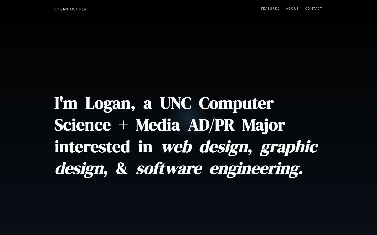
My previous portfolio was a clean, dark, text-first page that listed my work. I wanted the site itself to show how I design and what I can build.
Make the portfolio a design piece of its own: memorable and playful, without getting in the way of someone who just wants to see the work.
A retro desktop with an animated intro, filterable project windows and case-study pop-ups, plus a Modern mode that restyles the whole site in one click.
I moved from quick explorations to real, working pages, so every direction was judged in the browser at actual size rather than as a static mockup.
The first step: I used Google Stitch to generate fast layout explorations and find the directions worth pursuing before writing any code.
I built the promising directions out as live sites with Claude, pairing on the layout, the intro animation, Modern mode, accessibility and responsive fixes, and the deploy.
The project covers, the pixel-art thumbnails on every card, were designed with Claude Design so they share one visual language with the desktop around them.
Before settling on Logan.os, I took several directions all the way to working pages. They're all kept side by side in my portfolio-designs repo.
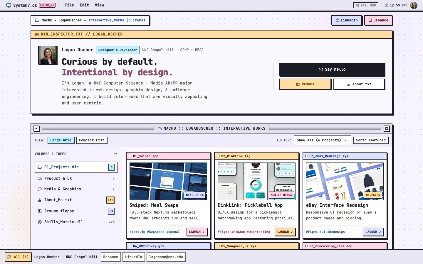
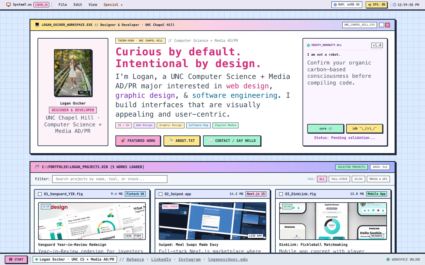
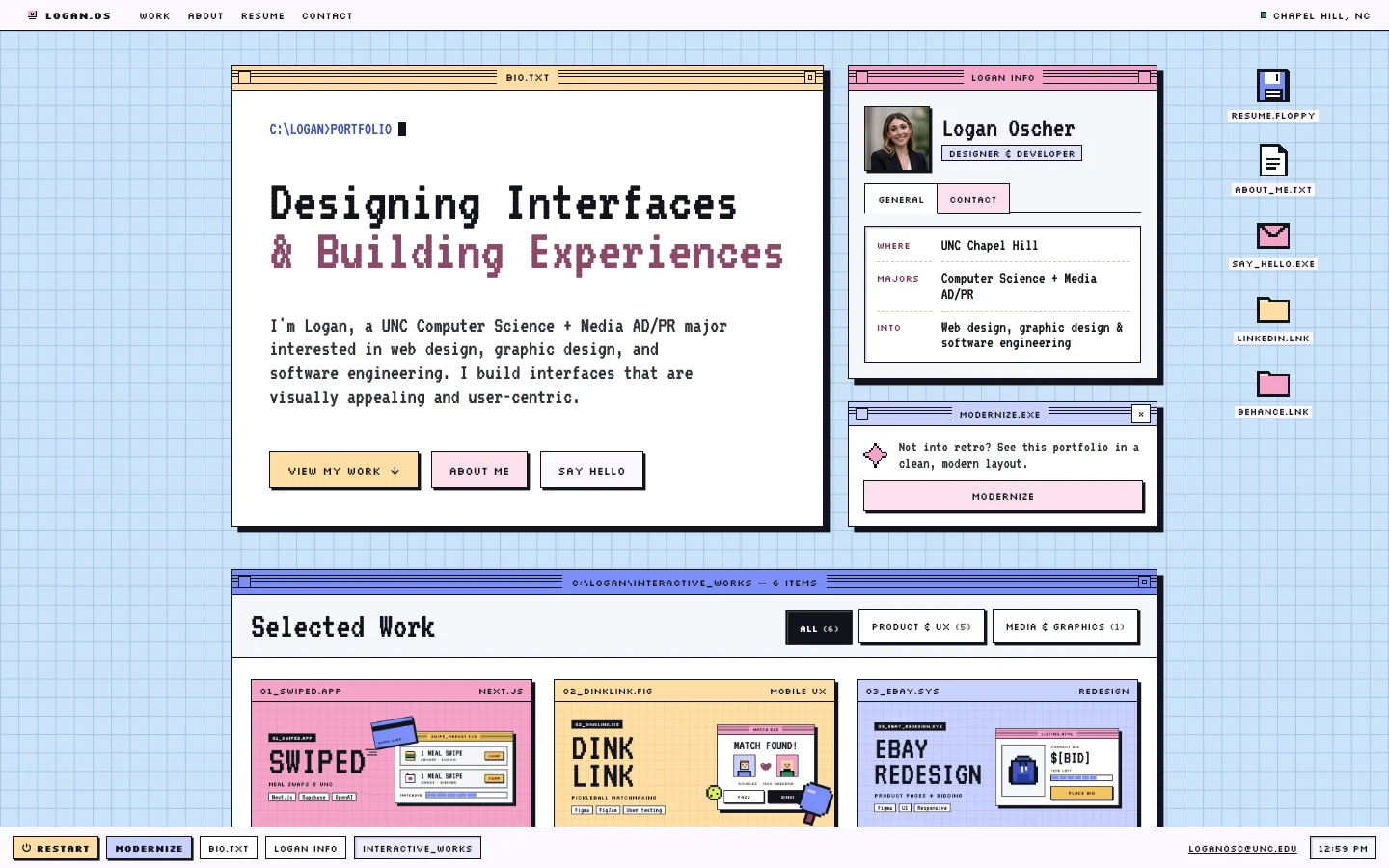
The OS metaphor turns every section into a window (bio.txt, Logan Info, Interactive_Works), so the playful idea also organizes the page.
Full-bleed windows give each project a large, color-coded card, and the covers carry most of the color so the work stays the focus.
It's a design piece and an engineering one: a strong visual concept from my Media side, built by hand from my Computer Science side.
Retro isn't for every reader, so Modern mode keeps the same content in a clean layout, one click away.
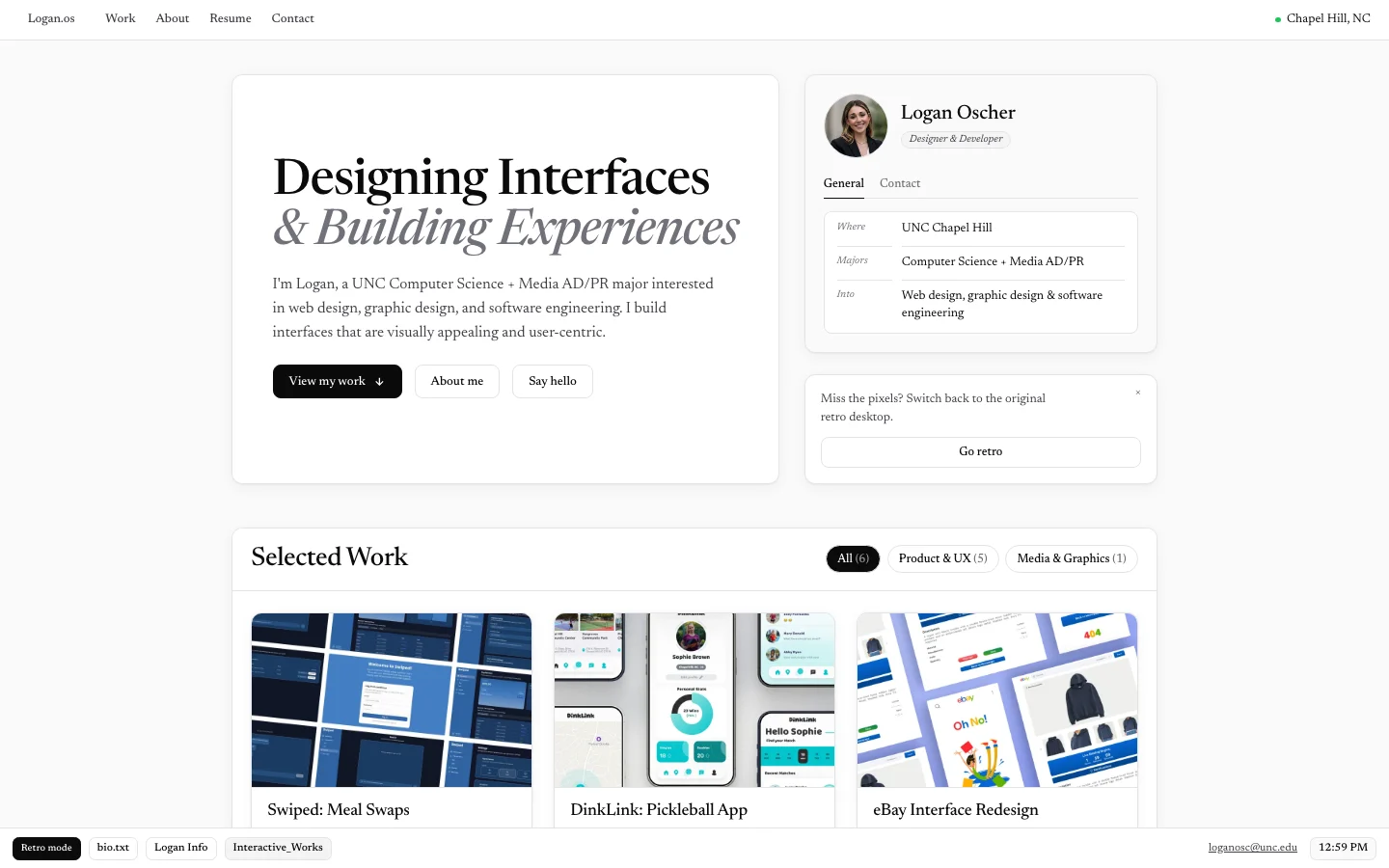
The taskbar's Modernize button, or the tip under Logan Info, restyles everything instantly with no reload: hairline borders, soft shadows, the Newsreader serif, and mockup covers instead of pixel art. The choice is remembered and applied before the first paint, so neither look ever flashes.
Plain HTML, CSS and JavaScript. Modern mode is a separate stylesheet scoped to one class, so the retro design stays the source of truth.
Images are lazy-loaded WebPs, each mode downloads only its own covers, and versioned CSS and JS links keep returning visitors current.
Keyboard focus that never gets lost, screen-reader labels and announcements, reduced-motion support, and text colors checked against WCAG contrast.
Desktop renders at a relaxed 85% scale, and the hero headline stays on two lines at any width; tablets and phones stack the windows, with the desktop icons moving to the bottom as contact links.
Project write-ups open in a themed window. Swiped, DinkLink and Vanguard are generated from their standalone pages by a small sync script, so each has one source.
A push to GitHub deploys the site to loganoscher.com automatically through a GitHub Actions workflow.
Every design exploration, including Logan.os, lives in one repository, and the live site is deployed from its own.
Digital Media & Graphic Design
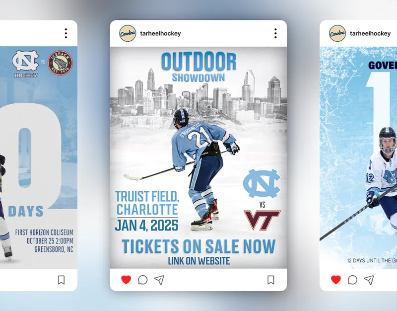
I created a series of promotional graphics for UNC Hockey that highlight major games, countdowns, and announcements. My goal was to capture the energy of UNC athletics while keeping the visuals bold and recognizable for fans. Each piece uses consistent typography, color treatments, and layout patterns to reinforce the team identity. The graphics were built for Instagram and other social platforms and were designed to stand out in fast-scrolling feeds.