UI/UX · Redesign
Vanguard Year-in-Review Redesign
Making Vanguard’s Year-in-Review clearer for investors ages 50+, with stronger guidance, trustworthy visuals, and next steps that feel obvious.
Project Snapshot
Role & Scope
UX researcher and product/visual designer redesigning Vanguard’s Year-in-Review for investors 50+.
Timeline & Tools
Semester project using Figma, user testing, card sort/flows, persona work, and PDF deliverables.
Deliverables
Personas, structure/flows, usability findings deck, UI kit, 10+ wireframes, 20+ hi-fi panels, interactive prototypes.
Overview
The problem
Investors 50+ struggled to find key financial insights. Metrics lacked context, visuals felt decorative instead of informative, and fee information was hard to uncover—eroding clarity and trust.
The goal
Enhance clarity, trust, and usability for digitally active investors 50+. The work was driven by research, moderated tests, surveys, and accessibility priorities.
Audience
User profile
Digitally active investors ages 50–70 who value straightforward wording, trust signals, and simplified navigation that tells a clear financial story.
They want reassurance that every step is purposeful, with language that reduces anxiety and highlights why actions matter.
Research & Discovery
Listening & personas
50–70 age group interviews and empathy work to surface needs for clarity, trust signals, and predictable next steps.
Usability testing
Think-aloud sessions and surveys with 50+ investors on the existing Year-in-Review revealed navigation confusion, jargon friction, and weak next-step guidance.
Insights → design
Guided anchors, plain language, contextual tooltips, and checklist clarity mapped directly to observed pain points.
See embedded testing deck for full findings and methods.
User Testing Findings
Study setup
50+ participants evaluated the Year-in-Review prototype via think-aloud sessions, tasks, and pre/post surveys to measure comprehension, trust, and next-step clarity.
What worked
- Clear language raised confidence and trust.
- Progress indicators and checkmarks motivated completion.
- Anchored steps and inline explanations reduced context switching.
Minor problems
- Abstract visuals felt unhelpful or unprofessional.
- Users struggled to locate “Year in Review” and fee information.
- Complex terminology still tripped up some participants.
Major problems
- Unclear where to go after finishing the Year-in-Review; checklist links felt abrupt.
- Uncertain destinations made people hesitant to click and unsure how to return.
- Advanced users wanted deeper breakdowns; beginners needed clearer metric explanations.
Testing report (PDF)
Usability findings presentation embedded below.
User voice
- “If I look at this checklist, I’m getting a little bit confused.”
- “This kind of feels overwhelming, so I don’t know how those links work, or what is there on those pages?”
Redesign Highlights
Guided structure
- Added visual anchors and numbered steps at the top.
- Removed playful illustrations and refocused the hierarchy on readability.
- Clear action labels: Edit Retirement, Review Contributions, Review Accounts, Goal Optimizer.
Context & clarity
- Contextual explanations, modals, and tooltips unpacked complex terms.
- Narrative text explained why each section mattered.
- Graphs tied directly to the insights they support.
Tone for 50+ users
- Reassuring language reduced anxiety.
- Definitions via info icons and dropdown modals.
- Predictable next-step flow removed end-of-journey confusion.
Structure & Flows
Mapped the revised Year-in-Review structure and key flows to clarify entry points, task progression, and how users branch into deeper tasks without losing context.
Wireframes
Initial sketches and grayscale frames to validate structure before adding visual polish and interactions.
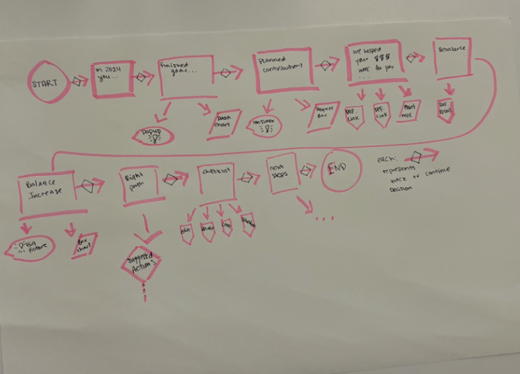
10+ grayscale/mid-fi screens vetted for hierarchy, flow, and terminology before hi-fi styling.
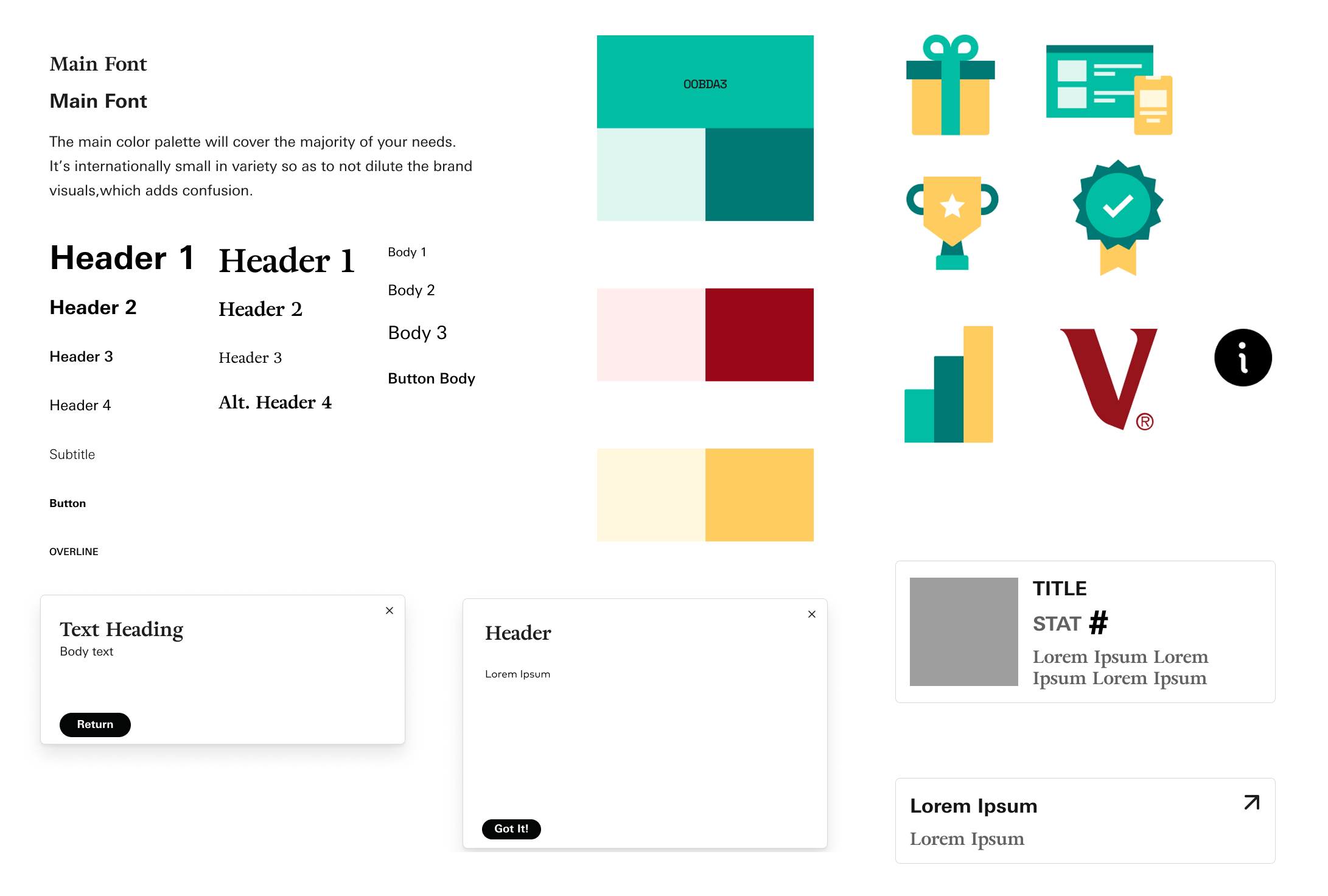
Style Guide / UI Kit
Color palette, typography, and components aligned to Vanguard to keep the experience consistent end to end.
Process Sketches
Early explorations captured as quick sketches and task progression snapshots before moving into mid- and hi-fi work.
Challenges & Trade-offs
Simplicity vs. depth
Balanced clarity for beginners with deeper breakdowns for advanced users by layering defaults, tooltips, and optional detail drawers.
Terminology vs. brevity
Kept language short but added inline definitions and info icons so jargon never blocks progress.
Guidance vs. clutter
Used numbered anchors and progress cues without overcrowding the UI, prioritizing readability over decorative visuals.
The Pitch
Lead with a signature flow: numbered anchors and plain-language action labels (Edit Retirement, Review Contributions, Review Accounts, Goal Optimizer) that create a predictable path for 50+ users.
Replaces playful visuals with a readability-first hierarchy, tying graphs directly to insights and pairing each step with a short “why this matters” narrative.
Builds confidence through contextual tooltips, info icons, and reassuring copy that keep complex terms and next steps clear—reducing end-of-journey confusion and anxiety.
Redesign PDF & Wireframe
View the full case study and wireframes below, or open them directly in a new tab.
20+ hi-fi panels across the mac flow; Figma links set to “Anyone with the link can view.”
Reflection
This redesign pairs straightforward language with a guided structure to lower friction for a regulated, high-stakes flow. Next iterations would A/B test the numbered path, refine checklist clarity, and expand analytics around where investors pause after reading their performance story.