UI/UX · Product Design
DinkLink: Pickleball Matchmaking
Building a mobile product that makes it easy for local players to find partners, organize matches, and keep up with their progress without getting lost in menus.
Overview
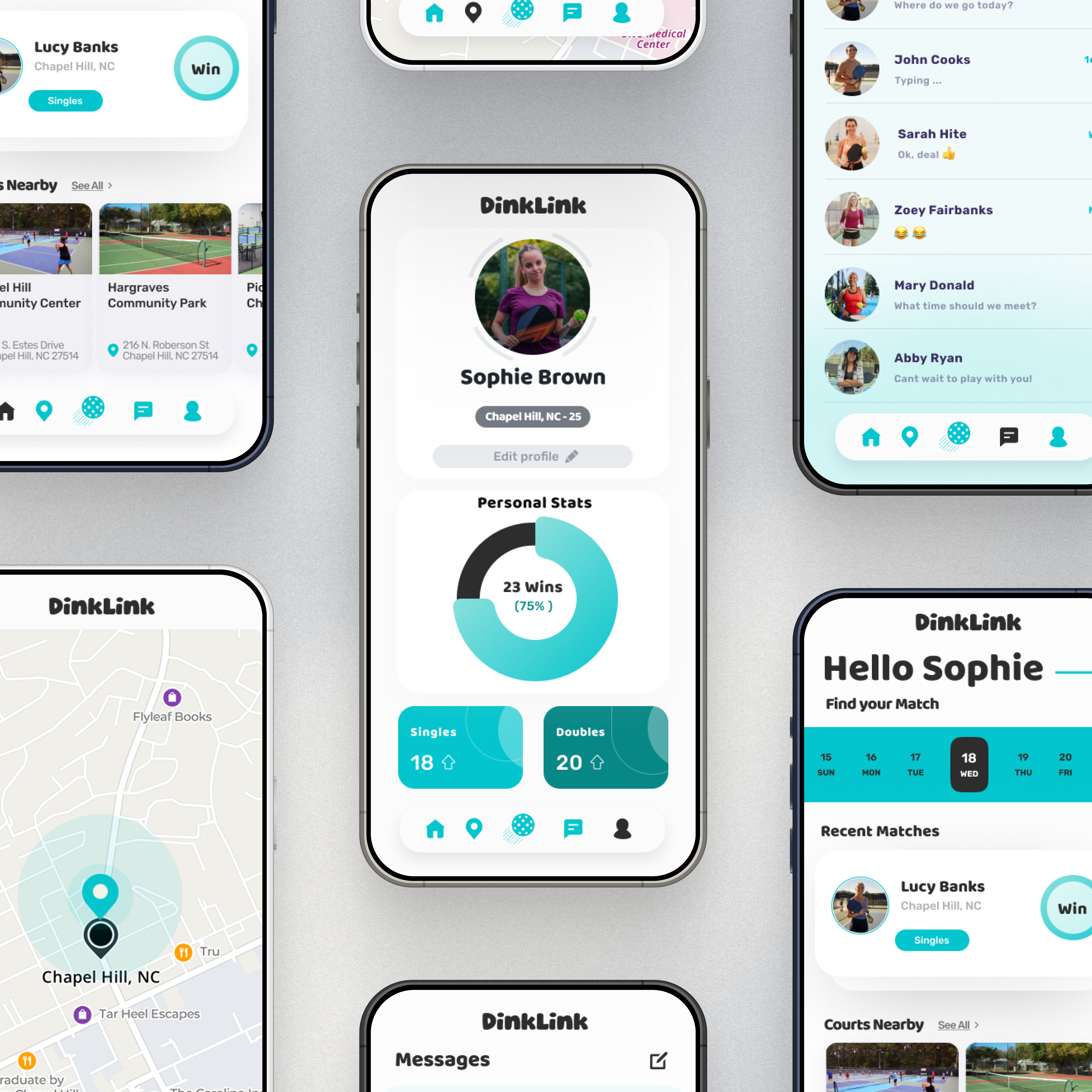
DinkLink connects recreational and competitive pickleball players through a simple profile, matchmaking, and messaging experience. The goal was to reduce friction for pick-up matches while highlighting the stats and context players need to feel confident when reaching out.
Problem
Local players struggled to discover partners who match their skill, schedule, and preferred courts.
Outcome
A streamlined flow that surfaces nearby players, courts, and recent results in one glanceable feed.
Impact
Clearer onboarding, stronger profile signals, and faster conversations increased successful match requests in testing.
Discovery & Research
I interviewed five recreational players and mapped their current tools: text chains, Facebook groups, and ad-hoc spreadsheets to track scores. The common friction points were confidence in a partner’s skill, knowing which courts were free, and coordinating logistics without endless back-and-forth.
- Players needed a quick read on skill level, preferred times, and recent matches.
- Court availability and distance were key deciding factors when accepting an invite.
- Messaging needed to stay lightweight, with match details attached to avoid confusion.
Design Approach
I built the interface in Figma with a focus on clarity: minimal chrome, strong typography, and modular cards that keep stats, partners, and court info aligned. I kept the visual language calm and confident so newcomers feel welcome while advanced players still get the details they expect.
Profile clarity
Progression badges, win/loss summaries, and common availability quickly communicate fit.
Matchmaking
Filters for distance, skill tier, and preferred format reduce the time to find a partner.
Messaging
Contextual threads attach location, time, and gear notes so players stay on the same page.
Solution Highlights
The final flow centers around a home dashboard that balances discovery with action. Players can move from browsing to inviting in under three taps while keeping court logistics transparent.
Home feed
Nearby partners, suggested courts, and recent matches appear in a single vertically scrollable stream.
Match request
Quick-select time blocks and skill tiers auto-populate invites to cut down on coordination messages.
Stats & history
Lightweight charts surface momentum without overwhelming casual players.
Outcomes & Next Steps
Testers were able to create a profile and send their first invite in under three minutes. For a next iteration, I plan to pilot a lightweight availability calendar and integrate local club schedules.